I heard a song on BBC Radio 1 about 2 weeks ago and have had the tune stuck in my head ever since. The song stuck in my head was Foster the People - Pumped up kicks
Despite not paying much attention to the radio at the time I was fully aware that this was not the song I had listened to, after a little digging I discovered that the song I had heard was; Chloe Howl - No Strings
Now, is it just me or does the baseline extremely similar/verging on identical? I'm not attempting to suggest copyright or anything close to that, I just found it interesting that hearing one song resulted in me having a completely different one stuck in my head. Personally if I was to make a song, I'd want it to sound unique, not something that contains previously heard, distinctive elements from a successful song.
Regardless of the similarities and my small rant, No Strings isn't a bad song, but Foster the People would win hands down!
Today was payday and I was finally able to buy myself a hard copy of Gabrielle Aplin - English Rain.
If you follow my blog you will know from many previous posts that I am a huge Gabrielle Aplin fan and have been for a long while. Her album is one I have eagerly anticipated and I am not at all surprised to inform you that it did not disappoint. I've said it before and I'll say it again, her voice is beautifully flawless. There is a raw innocence to her voice and indeed her music which comes through strongly in each and every song. There is something about music when it's true to the artist that just makes it so much more captivating, the lyrics are meaningful, melodies honest and simple and yet powerful enough to make you fall in love with every track.
Seeing as I usually ramble on about her music and bombard you with whimsical descriptions of lyric and melody etc, I shall instead focus more on the visual artistic qualities of the album. I think quite simply, the title of the album itself; 'English Rain', captures the very essence of the feel, mood and look of the whole album. It's simple, to the point, visually descriptive, beautiful and raw. I'm often disappointed with album titles but this, although taken from a lyric of one of the songs is perfectly fitting.
Going back to the raw and innocent qualities I mentioned earlier, I feel like this comes across strongly in the design of the album artwork and CD itself. The simplicity of the design is beautiful. It's not overpowering, it's not crowded or over complicated. It has clarity and again works perfectly with the title and the images that alone conjures. Everything from the font to the contrasting rainbow colours against the greyscale; portrays a strong carefree, youthful element.
Uncomplicated, innocent, beautiful and honest - descriptive of both visual and audio elements of this album.
Gabrielle Aplin. English Rain. Music. Acoustic. Album. CD. Artwork.
Gabrielle Aplin. English Rain. Music. Acoustic. Album. CD. Artwork.
Gabrielle Aplin. English Rain. Music. Acoustic. Album. CD. Artwork.
Gabrielle Aplin. English Rain. Music. Acoustic. Album. CD. Artwork.
Gabrielle Aplin. English Rain. Music. Acoustic. Album. CD. Artwork. Track list.
If you're not already a fan or if you are and are yet to hear this album, take a listen. You won't be disappointed.
Dreamcatchers are something that I have always admired from a very young age. They are effortlessly elegant and regardless of colour, design or size - always beautiful. The intricacies of the design combined with the simplicity of the concept result in something that can provide both aesthetic admiration and personal meaning to the individual.
Dreamcatchers originate from the Native American Ojibwa Tribe; believed to be protective charms, Dreamcatchers are traditionally made with Willow Hoops and decorated with items such as beads, feathers and arrow heads. The Ojibwa believed that the dreamcatcher has the ability to protect a sleeping person by changing their dreams.
'Only good dreams would be allowed to filter through... Bad dreams would stay in the net, disappearing with the light of day.'(Konrad J. Kaweczynski)
The feathers are a significant part of the design when it comes to traditions and beliefs - it is believed that the good dreams that pass through the net would slide down the feathers to the sleeping person. The design and the belief are equally elegant and gracious. Regardless of your personal beliefs or superstitions it's hard to argue that the intentions behind such a charm are anything but well meaning and comforting.
A couple of weeks ago during a conversation with my girlfriend I mentioned how I had never had a Dreamcatcher but had always wanted one. She bought me one as a gift and it now hangs pride of place in my window. If you read my blog you won't be surprised by what will come next... I couldn't resist taking a few photographs!
This is a huge topic and is something I will in no way attempt to tackle.
Love - something we all experience at some point in our lives. I personally believe that no two people have the same experience of love, something so personal and pure must feel different to each individual. Maybe that's why it's so difficult to define? I've been thinking about how something so intense and consuming is so difficult to put in to words. Something that you are meant to express is sometimes impossible to do fully. To write about love it not to write about emotions or thoughts, but feeling - both physical and emotional. It's the emotional feeling that is the hardest to describe, how can you put something in to words that has no physical form? Something that only you can ever experience. There are no words for something so individual.
I was wondering whether love has the same effect on photography in terms of subject matter. Is it possible to 'capture' love? or is it merely a recreation of the expectations, stereotypes and generalisations of love? I did some research and was surprised by how difficult it was to find good photographs among the abundance of love themed images of hearts and generic couples.
I came across a few images which stood out to me and neither really scream love at you but there is something about them that I think has a deeper meaning. Maybe I have just read in to it too much, but;
This image, although technically one of the 'generic couple' photos I was just complaining about, is actually the one image that I felt powerful enough to use as an example. Granted, it isn't the most aesthetically pleasing photo, the rooftops aren't exactly picturesque, the sky isn't perfectly clear and the couple are, well, ordinary. But actually, those are the exact reasons I like it. It's simple, effortless and surprisingly natural. Isn't that what love should be? I love the contrast between the harsh skyline and the romance of the couple, the shoe carelessly left on the roof. The fact they're on a rooftop feels like an escape and the fact the sky isn't at all perfectly clear just adds to the intensity. Such an open expanse is impossible to comprehend, perhaps even impossible to put into words...
In all, the photo is very ordinary, but depending on what you want from it, it is capable of providing contrasts and perhaps is getting close to capturing love, or at least a fraction of it.
If you haven't seen it yet, watch it now before you read any further.
I don't even know where to begin explaining how much I LOVE this video! It could not be more different to any of their previous videos yet it works so perfectly. It fits effortlessly with the feel of the new album, it's fun, carefree, exciting and new. Granted, the actual video may not fit perfectly with the lyrics, but on the other hand, the visuals match the mood so it depends on where you stand on literal videos.
For me personally I love seeing Paramore like it, it's fun and enjoyable to watch. I can't recall another video in which Hayley dances and it makes a nice change to see such an involvement with the music as opposed to a scripted video like 'Now' and 'Playing God' for example.
From a fashion, hair and makeup perspective, Hayley never disappoints. She is without doubt one of those people we all envy who can pretty much get away with wearing anything that would most likely make the rest of us look like a thrift shop had exploded. We've seen the orange and pink hair before but more so as solid colour as opposed to a combination. It is safe to say that I haven't been a fan of Hayleys fringe of late, there was something about it that wasn't working. However, in this video everything pulls together to create an extremely powerful, memorable look that we all love to see. The makeup is interesting as despite the amount, it gives Hayley a much softer elegant look. There is a much more girly feel to how she looks in this video as opposed to the majority of the styles in the others. And again this fits in well with the carefree/fun element of the video.
The tights - I think they speak for themselves, they are incredible and anyone who can pull off wearing them is extremely lucky!
For anyone who's interested in the style breakdown;
I'm sure there will be more Paramore updates as more songs and videos from the album are released but for now, I am all Paramored out!
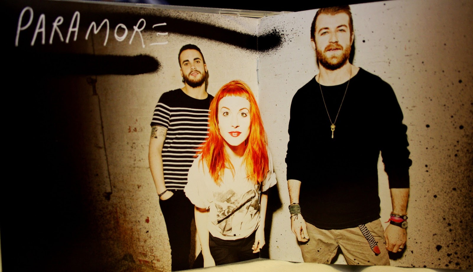
For me this was the most anticipated album in years. With 'Brand new eyes' being released in September 2009, what seems like an eternity of waiting is finally over! For anyone who likes Paramore you'll know that as a band there have been a lot of changes over the last few years, with two members leaving. With such a big change in band that has a very distinctive sound there were questions as to what should be expected from this 4th album.
Of course, they did not disappoint and I personally feel that the self titled album 'Paramore' is definitely on par with their previous releases. The album consists of 17 tracks, a combination of full length songs and shorter acoustic interludes. The interludes - to paraphrase Hayley from the Radio 1 live lounge interview - are to allow the listening audience to see a different side to Paramore as it is something they feel isn't seen as often as the other elements of the band and band members.
The album as a whole feels new. It feels like a new Paramore, a new sound, a new look, a new energy and excitement. However despite this there is no doubt that it's the same Paramore as ever. The vocals are incredible, lyrics heartfelt and meaningful, the album perfectly and emotionally depicts the stories behind each song and developments over the years. In a way it feels like Paramore have rejuvinated as opposed to reinvented. There is a new found excitement, you can hear the fun and the passion in the songs as opposed to perhaps a slightly more negative vibe that came from 'Brand new eyes'
Each track on the album is distinctly different and each has its own story, own mood and sound. For example, 'Ain't it fun' is a track that would perhaps seem out of place on an album like 'Riot!' but fits in perfectly here, with a fun unique sound that contrasts drastically with 'Hate to see your heart break' for example, Paramore have really explored every avenue of their musical capability and are rightly displaying all the sides of themselves that maybe we hadn't realised were there before.
It's fresh, fun and exciting which is exactly how music should be. I don't think they could have gotten it more right and I highly recommend you listen ASAP.
Stepping away from the music for a while, as you know I love album artwork, disc covers and the general visuals of a hardcopy album. The look and feel of the album has the same effect as the music itself. It's new, fresh, different and aesthetically pleasing.
Paramore, 'Paramore', Album, music, 2013
Paramore, 'Paramore', Album, Music, 2013
Paramore, 'Paramore', Album, Music, CD, Disc, 2013
As opposed to the red, white and black of Riot! and the Blues of All we know is falling and Brand new eyes, 'Paramore' certainly gives off a different vibe. It feels more personal, more energetic and much more involved than before.
If this is the direction Paramore are heading then I cannot wait to hear what comes next!
I apologise now as I am about to bombard you with 3 Paramore related blog posts... It has taken me a few days longer than I would have liked to get around to posting these but better late than never - hopefully!
Okay so firstly, in anticipation of the release of their new album, Radio 1 had Paramore as guests in the Live Lounge last week. To any of you who listen to Radio 1 and appreciate good live music then you will understand that a favourite artist combined with Live Lounge is more than enough grounds for extreme excitement.
Live lounge traditions see artists play one of their own songs and a mystery cover. However, due to the distance traveled Paramore were given an extra slot so the playlist went as follows;
Still into you Matilda (Alt-J cover) Hate to see your heart break
This is an extremely exciting playlist for me for more than one reason. The first obviously being that any sound that leaves Hayleys mouth is vocal perfection. The mystery cover could not have been more perfect! I love Alt-J and Matilda is such a beautiful song, hearing Paramore cover it in such a stripped back pure way was incredible and is easily my favourite live lounge cover to date.
Secondly, 'Hate to see your heart break' was a world exclusive and was aired before they were set to premier the track later that evening, for anyone who appreciates new music you'll know that that is a pretty big thing.
I won't make this any longer than necessary but I strongly recommend checking out the other two live lounge performances on youtube as if you're a fan you won't be disappointed and if you're not, well you just might be surprised!
Adding the photography section is a clear move away from the specificity of hair and makeup artistry, but is something that is much more fitting to me. Photography is too much of an important part of who I am and what I want to do to incorporate it as an element within something else.
Just to state the obvious, I haven't posted anything for a few weeks... This is for two main reasons; 1. Nothing has really inspired me enough to get excited and feel the need to endlessly ramble on for ages about on here. 2. I've been working on my website that I've linked on here before - I'm working on adding a Photography section for all of my personal photography from outside of Uni. I also have a possible photo shoot collaboration coming up soon so it would be good to have a section ready made for those images if and when they happen! (I will link my website again when it is all newly updated (: )
Okay, so as you know I like to write and I tend to post about poetry on occasion when the mood takes me - but never my own. That is always something I keep very private. However last week one of my best friends asked me if I would write a poem for her for a short film she is making at University. I figured that as it was written for the purpose of being seen that I shall brave it and share it with you. The theme and guidelines I was given were; - A poem about Transition of the voice. - How it can be changed through movement and distortion. - 14 lines.
This was my outcome (They decided to use it in the final film)
Tran-si-tion Loud and clear it carries through, Voices spill from lungs outgrew
Though concrete barriers it cannot break, Accents change and sounds they shake
Words recoil and echoes merge, Impenetrable the walls they purge
Distortion steals the perfect form, Connection from all meaning torn
Reverberation's all that's left, Surrounded by a silent theft
Movement comes as structures fade, Invisible languages masquerade
Clarity of speech now askew, Transition from the known to new. x
This is possibly one of the nicest things I've come across in a long time. If you're having a bad day or just like genuinely nice things visit the link below. It'll make things that little bit better :)
I think this is the most excited I've been about a blog post - or anything in general - for a long time. For any of you who know me, you'll already know that I am the biggestParamore fan. They can do no wrong as far as I'm concerned. I could endlessly list my reasons for why they are my favourite band but I'll resist.
Hayleys' vocals never fail to disappoint, there is something about her voice that captivates me and draws me in to every single song. This, combined with the emotion fueled, meaningful lyrics provides (in my opinion) an endless stream of incredible music. Their new video for 'Now' has been criticised by some fans on Youtube as not fitting to the song/lyrics. I disagree with this entirely, but I guess that everyone will draw their own meaning from their interpretation of the song. To me the lyrics are powerful and are about sensitive issues that everyone can relate to in one way or another. The beat and melody of the song fits my interpretation of the mood and subject matter perfectly, building in exactly the right places. I could go on about the song forever but what this post was actually intended for was the visual side of the video. The makeup in this video is very different to what we usually see on Hayley. Known for her bold eyebrows, bright eye shadows and more recently a touch of lip colour, this very neutral pallet is a harsh contrast. The blocked out eyebrows and white eyes/lashes initially stand out at the beginning of the video and if I'm honest, aren't the most flattering. However, as the video progresses we're introduced to explosions of colour (literally) and this is when the makeup starts to work its magic. The use of colour in the video is powerful and symbolic, this then contrasts greatly with neutral makeup causing Hayley to look vulnerable and very pure. This is most notable when Hayley is covered blue towards the end. This visual contrast between power and vulnerability is fitting to both the lyrics and the meaning and to me, provides a much more conceptual element to both the song and the video.
Long weekends away are not something I indulge in often but I allowed myself the luxury this past weekend. I'm not usually very lucky with when I have my holiday from work booked, it never coincides with anything interesting and it always seems like a bit of a wasted holiday. However, this was not the case last weekend when I realised my holiday was perfectly timed with my friends birthday weekend - it was therefore only natural to take a trip to Cornwall - Lostwithiel in particular - to see her.
This excited me for many reasons; 1. I haven't seen Lauren since Graduation week last November (when you spend 3 years with someone, a few months apart is a long time.) 2. If my childhood (especially summers) could be a place, it would be Cornwall. I have so many memories from holidays there as a child, there aren't many places I haven't been to. Being there puts me at ease instantly and is one of the only places that just by sight and smell alone can make me truly happy, so I was more than looking forward to being back there. 3. It provides me with the perfect opportunity to take some photos - weather permitting of course!
We took a trip in to Fowey on my last day there, Fowey is one of my favourite places in Cornwall. There isn't much to do there (and you need to be relatively fit to get up the hills), but it's so typical of a small Cornish town. It's picturesque, quaint and peaceful. The weather wasn't too bad on Monday so I took the opportunity to take some photos whilst I was there.
Fowey, landscape, ocean, photography, beach
Fowey, landscape, photography, cornwall
Fowey, quaint, photography, houses
The lighting isn't as good as I would have liked but hopefully you'll be able to get a feel of the kind of place Fowey is. On the drive home from Fowey, we stopped very briefly at Polkerris. It consists of cottages (which are beautiful), a beach and a pub/restaurant or two. It's very small but very beautiful. The rain had set in a little by this point but I couldn't not take some last quick photos before leaving to get the train home.
Before I get started; to any of you reading this who aren't familiar with the band Deaf Havana - go listen to them, now. It will be worth your time.
Deaf Havana - Fools and Worthless Liars
Okay, so there is a lot I want to cover in this post, from music and lyrics to themes and photography. I'll try my best not to ramble...
I'm not sure why it has taken me so long to post about this album, but better late than never!
There aren't many albums that I can honestly say have me gripped from start to finish. Usually there's that song that we'd happily skip or one that doesn't quite fit in with the rest, but Fools and Worthless Liars had me hooked from the beginning.
The album have a very nostalgic theme which comes across very strongly in both the song titles and lyrics, I often find with songs with strong lyrical themes, the music isn't quite as fitting as it potentially could be. However to me, everything about this album works, the melodies and moods of the songs, the pace changes and the emotion in the lyrics all draw you in, allowing you to feel the reminiscent lyrics. Deaf Havana - Hunstanton Pier
Deaf Havana - Youth in Retrospect
Aside from the music, one thing that can really make an album special to me is the album artwork in the lyric book. Imagery is so powerful and can help create or reinforce the mood of the whole album. I am often met with disappointment however, when the artwork is somewhat disconnected from the music.
The nostalgic theme that is explored within this album tells personal and emotional stories within every lyric, the visual potential of such a strong theme left me eagerly anticipating the artwork and I wasn't disappointed.
Nostalgic photography, when done well is very powerful - it is however often overdone and becomes very generic. The idea of a nostalgic photograph has a very predetermined boundary, as it's usually fueled by memory and feeling it becomes easy to know what kind of images to expect. However this said, due to the memory aspect our views on this will differ considerably from person to person.
To me, the artwork for Fools and Worthless Liars finishes the album off beautifully and really brings together the themes, lyrics and moods explored throughout. The images are simple in way of setting, props and colour scheme, but are much more complex when it come to concept and mood. They're powerful and allow us as individuals to draw our own personal meaning from each image, to reflect on our own experiences behind the story being told.
Perhaps self explanatory due to the title of my blog, I don't usually tend to post about films. As much as I am a massive film enthusiast, and have a weakness for being sucked in to the more emotional films, my love for them is simply that - emotional. I prefer to post about things that get me excited creatively, that way I can analyse more as opposed to descriptively listing information to you. Of course, there are some films that are visually creative enough for me to have a creative opinion on - but it doesn't happen too often. I have however found a loophole in my theory with this film (albeit a small one), in which the most powerful moment of the film in my opinion, has a very small connection to Makeup. Although irrelevant to any form of makeup artistry, the pure fact it's related at all was enough to allow me to justify a non-creative post.
Freedom Writers. Freedom Writers is one of my all time favourite films and I have lost count of the amount of times I have seen it. It's one of those films where you have to see it to truly understand it. Any attempts of me trying to sell the film to my friends results in a boring description of a generic high school gang film. It is so much more than that and my words wouldn't do it justice.
Based on a true story, Freedom Writers explores every possible emotion you could experience - it's powerful, hard hitting and painful. Laced between the harsh truths however, are heart wrenching glimpses of unity and compassion that you would never imagine feeling for the characters from the beginning. "It's all about colour" is quoted near the very beginning of the film and sets up the entire scene in no more than 4 words. It also provides a perfect circular narrative as it is readdressed from a new perspective at a later point in the film. This is the moment I was on about earlier and to me, is one of the most powerful moments of a film I have watched. I won't go in to any more detail as I don't want to ruin it for any of you who may happen to watch it. Just keep an eye out for the small makeup scene between Eva and Sindy.
I never thought I would be uttering these words, but I am really missing having Uni work to do. I don't miss the stress and the deadlines, but I do really miss having projects. Something to research and develop, something that allows me to be as creative as I want to be. I miss getting excited when I come up with a new concept. Basically, I miss being creative.
It is surprisingly difficult to find something in everyday life that would provide enough interest and dedication to create a project of sorts. I have however decided on what I am going to do in my spare time over the coming weeks.
I've always been one to keep scrapbooks, photo albums, gig scrapbooks etc, but they're more of a documentation of events. I want to take my usual scrapbooking and turn it in to an inspiration based and inspiration forming project for both Photography and Makeup artistry. I want to display all that inspires me, build colour charts, form outline ideas and hopefully end up with a book of ideas and concepts that I would be ideally able to use as reference points in the future.
I have a vast collection of creative materials but one thing I always seem to be lacking is a selection of good quality paper, different colours, textures, thicknesses can really bring a visual project to life.
I ordered some paper samples from a company I used for my Final Major Project at Uni called GFSmith (http://www.gfsmith.com/), they can provide samples by specific request or a sample package which is what I ordered.
Paper, samples, colour, books
Paper, samples, colour chart, colour, texture
Paper, samples, colour, chart, book, texture
To any of you who don't love stationery as much as I do (probably quite a lot of you), this rather long post about paper will probably have gotten boring a few paragraphs ago.. But for those of you who are still with me I shall go on. The sample pack includes 2 booklets (both of which provide a fold out 3D colour chart) and 4 smaller books of paper samples. Every colour, thickness and texture of paper you could imagine.
The textures of the papers scream makeup designs at me, whilst the colours flood me with ideas for lighting and settings for photo shoots. To anyone looking at starting a creative project I would highly recommend having a look on their website :) I'll be starting my self briefed project as soon as I have all the materials I need, I'll try and be a good blogger and follow the progress! x
With temperatures not quite reaching above freezing, the soft light snow from yesterday is rapidly turning to ice. The silent footfall is now a very distinctive crunch; but the ice brings with it a different kind of beauty that you don't always get with snow. Wrapped in blankets and armed with my DSLR and a stepladder (Some of the icicles were high!) I submerged myself in the frozen beauty for an hour or so.
Snow, White, Winter, Sparkle.
Icicle, Ice, Winter, Frozen
Frozen. Spider Web, Ice, Winter
Icicle, Ice, Winter, Frozen
Even though my fingers have yet to fully regain feeling, braving the cold was definitely worth the hour it allowed me to enjoy taking these!
After weeks of threats of snow from the weather forecast, the eagerly anticipated, perfectly formed, chaos causing white flakes have arrived. I am usually the first to complain when everyone jumps on the bandwagon posting endless streams of snow photos online, but I couldn't resist a session with my camera out in the snow! As breathtakingly beautiful as it is, it is equally breathtakingly freezing - my fingers have just about thawed out enough now for me to be able to type this post. I love landscape photos when it comes to snow, but without a wide angle lens and with poor lighting conditions any attempts at landscape were met with disappointment. I changed to Macro and these are some of the resulting images.
One of my greatest simple pleasures in life is buying gifts for the people that I love. It is something I have always enjoyed and is one of the main reasons I look forward to being paid each month. Now that Christmas is done and dusted I turn my attention to birthdays. It's my nans birthday tomorrow and I wanted to get her something different, something that she can cherish but something that is also practical. Personally I don't think there is much use in presents that take a seat on a back shelf to be forgotten after the birthday excitement. Like myself, my nan has always been one to make sure she has a camera at a family gathering or special occasion - she refuses to invest in a digital camera however, but that's another story. As she has a film camera still and regularly has her photos developed I thought it would be nice to get her something in which she can store the more special photos, the ones she wants to see more often than when the dusty photo boxes get dragged out.
I was aimlessly wandering around Debenhams in Bath trying to think of the best place to go to find what I was looking for when I stumbled across this and instantly had to buy it.
Photos, photography, photo box, photo album, vintage, homeware, home decoration.
The photo on the website doesn't do the product the full justice it deserves! It really is beautiful. In real life it looks a lot more vintage and aged and the finish is perfect. For such a simple product it has a lot of character. I struggled to stop myself from buying everything in the section in which I found this! The vintage section in the homeware department at the moment is desirable to say the least and I recommend to anyone who has upcoming birthdays to buy for to take a look!
I am posting this video for two reasons. 1. I LOVE Benjamin Francis Leftwich <3 His voice is so hauntingly beautiful. This song makes me feel so positive about things, it's almost warming. 2. I am a little bit in love with the video. It's so simple and everything about it makes me want to do a photoshoot! The lighting, the beach setting, the reflections on the water, the silhouettes of the boat. It makes me yearn for summer and itch to take my camera to the beach. There is a lot about the video that I love that I'm not sure how to transcribe in a way that would get you all equally excited..
Give it a watch and maybe you'll see what I'm badly trying to explain. Enjoy.
It's no secret that January isn't typically high time for new exciting music. To fill my January music gap I've been delving through my iTunes library and getting excited about certain songs all over again. I use the word 'delving' loosely in this post as I haven't had to go back too far to find what I want to share with you.. I'm sure a lot of you have heard of Bastille, their song Flaws was played often on Radio 1 in the months approaching Christmas. As good as the song is, I much prefer this acoustic version.
Excuse the pun here, but in contrast to the title his voice is flawless. It's easy to listen to and every note brings stronger meaning to the lyrics.
During the mundane task of removing items from my external hard drive to create more space, I came across some of my old uni projects. In September 2011 we had to devise a sketchbook resulting in a Trend package that depicted our visions of fashion trends in Spring/Summer of 2013.
This is something I had never done before but I loved building the visual representation of a trend, pulling apart aspects of current environments and fashions and evolving them.
I hold out no hope for my trend predictions being even remotely right but from a purely visual viewpoint they come together relatively well. There are 10 sketchbook research pages that support the final outcome but I won't bore you all with them. My main inspiration came from the poor economic climate, the London Riots and the Olympics. A strange combination but things that feed off of one another.
I named my trend package 'Colour Injection' and it represents the move away from the negativity of the aforementioned economic climate and riots and towards something hugely positive like the 2012 Olympics. In terms of colour pallets this translates to a move from neutral colours - colours that mask personality, to vibrant colors that come part and parcel with the Olympics and the inevitable excitement. Like the injection of pride, hope and positivity, I predicted that the Olympics would bring with it an injection of colour in to how we present ourselves as individuals in 2013.
Sketchbook. Trend Package. Fashion. Colour.
Title Page. Trend Package. Fashion. Colour.
Trend Package. Fashion. Colour.
Trend Package. Fashion. Colour.
I'm not sure if you will be able to read the text on some of the pages as the font is relatively small. I apologise if that is the case!
It's safe to say that I'm not usually one for big celebrations when it comes to New Year. It's never been something I've been fussed about. However, this year my best friend moved to London so naturally a road trip to London and a very long weekend spanning New Year was inevitable.
I outdid myself with the sheer amount of photos that were taken in the space of 4 days, camera happy would be an understatement.
I won't bore you with endless streams of photos that frankly would only be entertaining for me and my equally abnormal friends, but I will share one or two which dare I say, teeter on the more creative side.
London. New Years Eve. 2012. Leicester Square. Lights.
London. New Years Eve. 2012. Leicester Square. Lights. Reflection.
London. New Years Eve. 2012. Leicester Square. Lights. Reflection.
I love reflection photography. It's rare for me to like my own photos but I am fairly pleased with the outcome of these!
Whilst everyone else around me was snapping away at the towering lights and billboards, I was getting overly excited at puddles on the ground.
I like the contrast and the sharpness of detail in something that is completely fluid. In comparison to the 'normal' photo at the top, the two reflections offer a much more dynamic - and in my opinion - exciting composition.